"Separation is the difference between a subject standing in a space and a subject pasted onto one. It's the first thing the eye reads, and the first thing flat AI video gets wrong."
Separation is the readable difference between the subject and the space behind them. It can come from texture, tone, color, or a rim, but it works best when the source still feels motivated. For prompts, describe the difference and where that difference comes from.
Don't light the subject.
Light the difference.
Put a person in dark clothes against a dark wall and they vanish — their edge dissolves into the shadow behind them. That collapse is exactly what flat AI video does by default: subject and background land at the same value, the same texture, the same color, and the whole frame reads as one plane with no one standing out of it. Separation is the fix — and the mental shift is this: you're not trying to make the subject brighter, you're trying to make it different from what's behind it. Light is the tool that builds that difference. There are a handful of differences you can build — in texture, in tone, in color — plus one specialized move powerful enough to deserve its own name. We'll take them one at a time, each in a single frame.
Texture: a smooth shape
against a patterned field.
Start with the most extreme case — a cinematographer pushing separation to the very edge of darkness, where you can watch it switch on and off. It also shows the first kind of difference: texture.
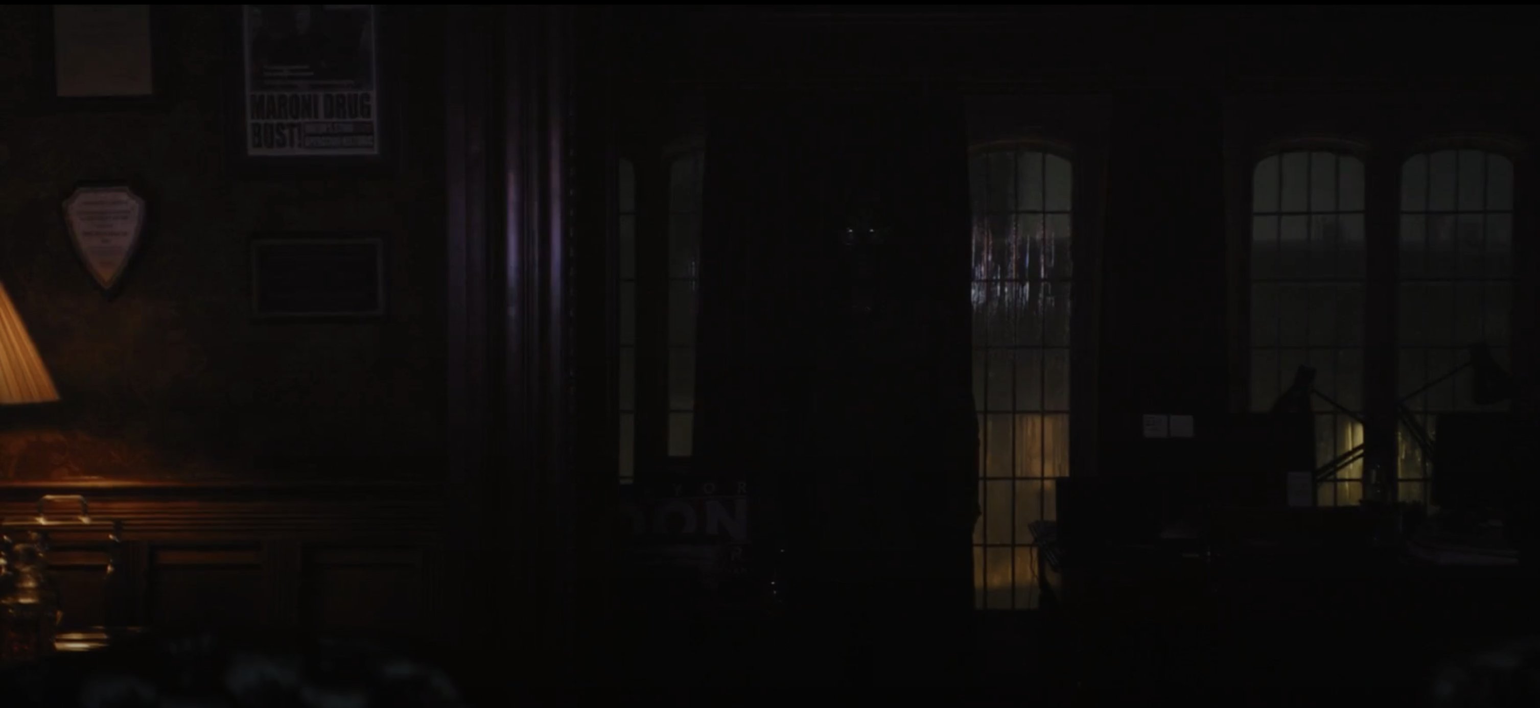
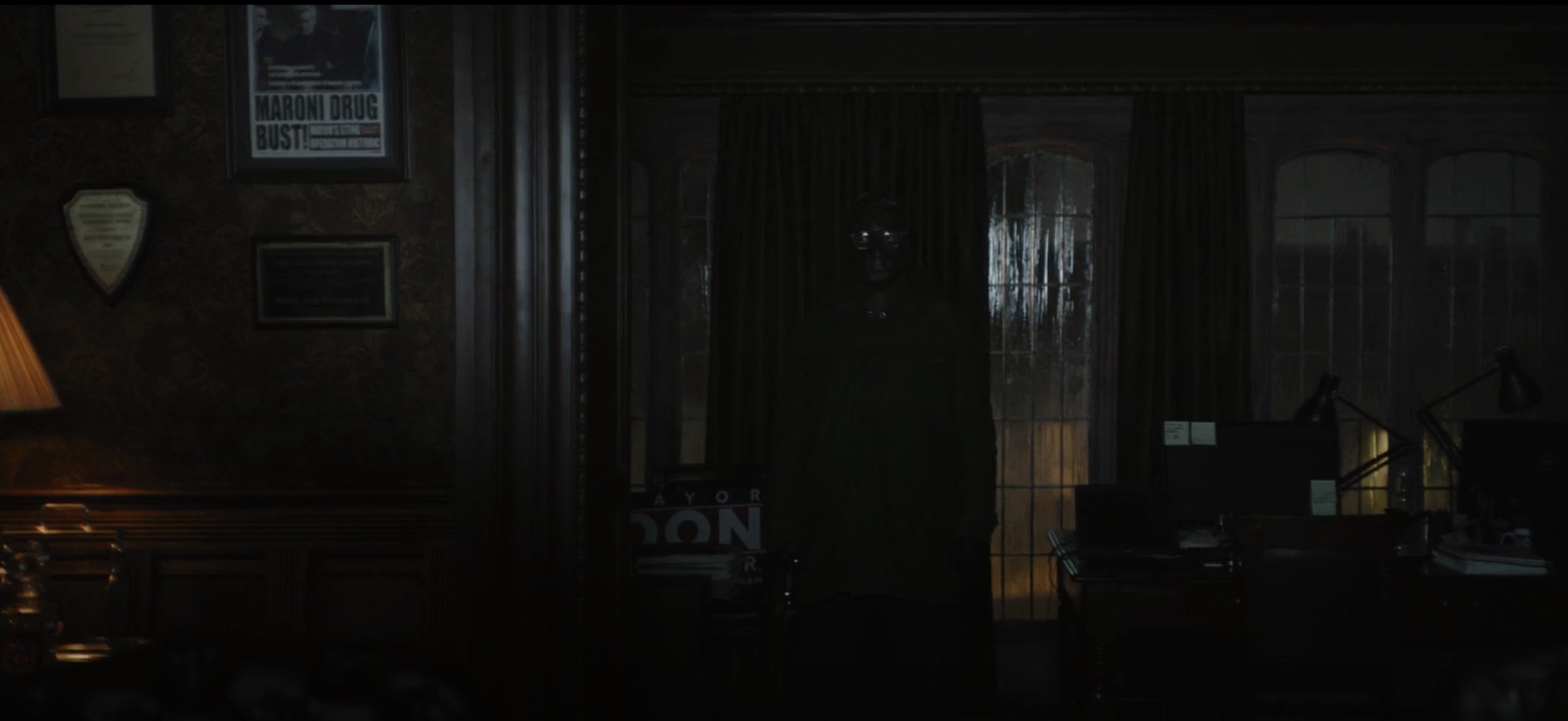
Watch what the light actually did: it didn't flood the figure, it grazed the curtain, waking its vertical pleats into a run of highlights. The background now has texture — a pattern — and the man, being smooth, reads as exactly that: the one place the pattern breaks. That's texture separation, and it's why the production hung a pleated curtain there instead of a flat wall: a flat wall has nothing for light to reveal. (Notice the light also models the shoulders of his suit into a solid shape — that's form, separation's quiet partner: a subject rendered as volume reads apart from a flat ground. Form rarely works alone, but it reinforces every other difference.)
Tone: the same color,
a different brightness.
The most fundamental difference of all is simpler than texture: brightness. A light subject on a dark ground, or a dark subject on a light one. The instructive version is when subject and background are nearly the same color, so brightness has to do all the separating by itself.
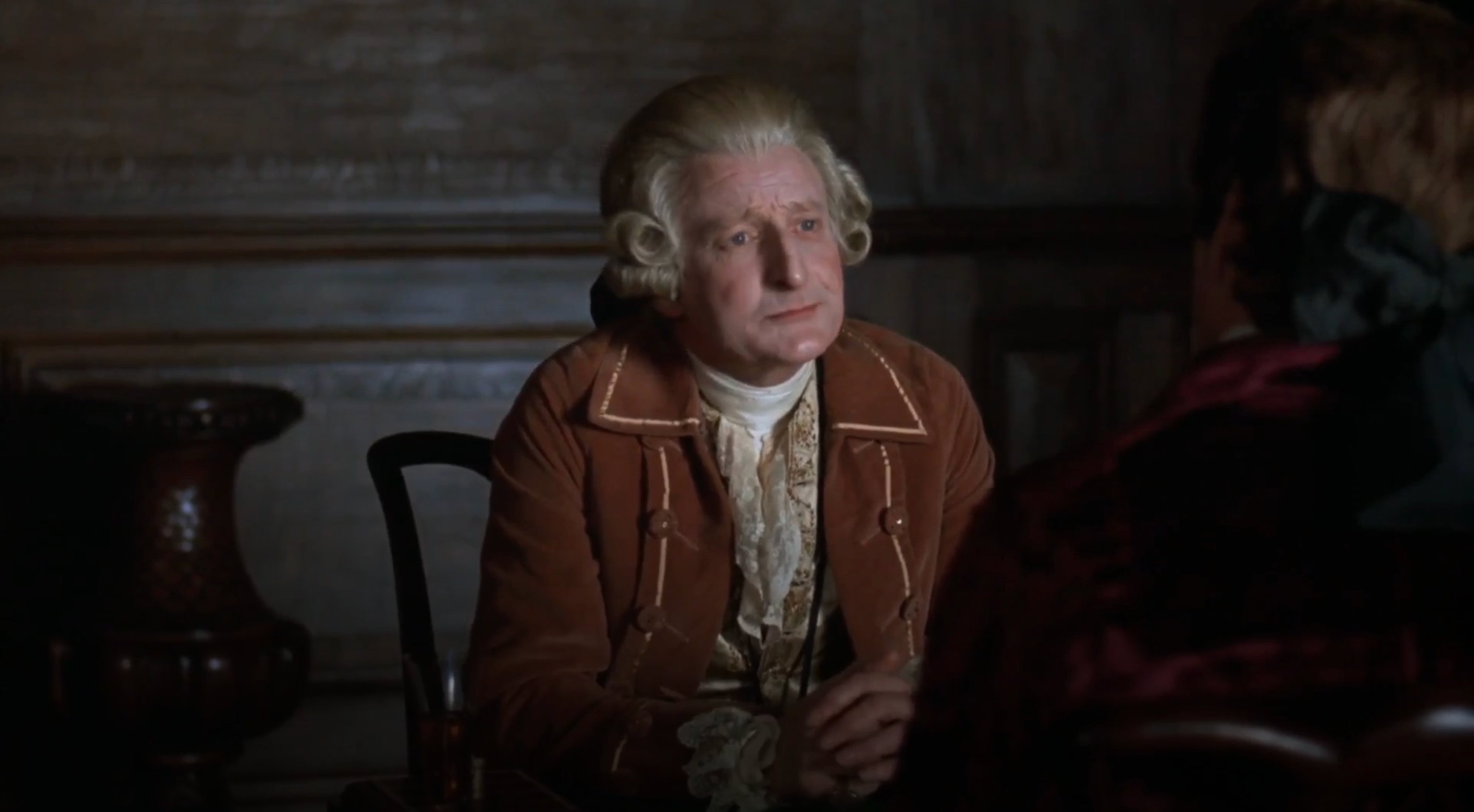
This frame is a clean test because color is taken off the table: his brown coat and the brown panelling are nearly the same hue, so they can't separate by color. And yet he reads instantly — because the light on him puts his wig, face, and shirt several stops brighter than the wall, while the background falls away into dimness. Brightness alone carves him out. It's the first thing to reach for: before rims or color, ask whether your subject is simply a different value than the space behind it. Often, lighting the subject a little and letting the background go dark is the whole solution.
Color: a warm subject
in a cool world.
The third difference is the quietest — it uses no extra brightness and nothing you'd normally call "lighting" at all. It works on color. Put a warm subject in a cool world and the eye snaps to them instantly, even in flat, even light.
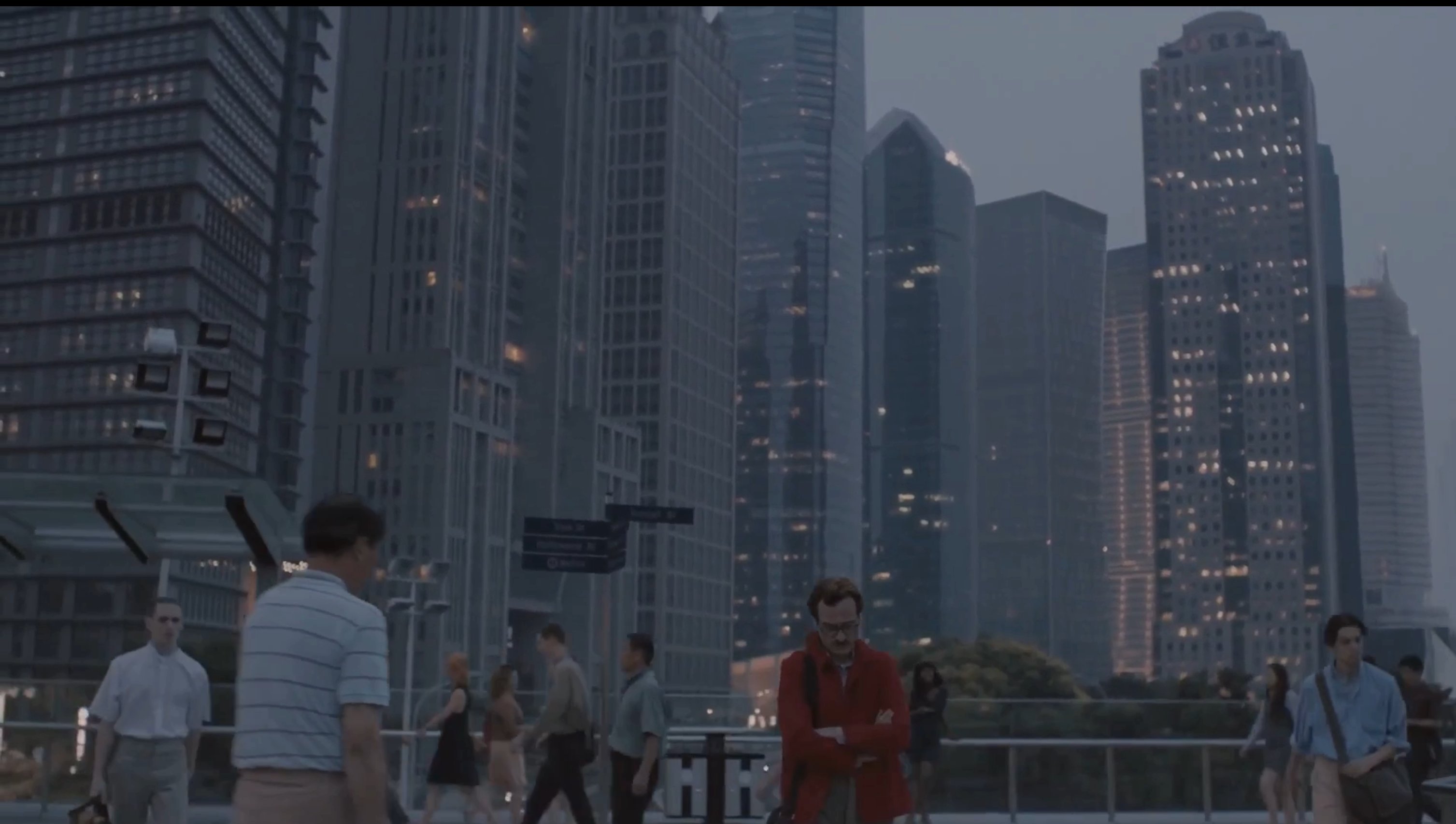
Look at it honestly: there's no edge light on him, and he's no brighter than anyone else on the walkway. By the rules of the last section he shouldn't stand out at all. He does — because everything around him is cool. The skyline is a hazy blue-grey, the crowd is in muted, desaturated tones, the whole world is dialed toward cold. He's in warm red. That single difference in hue pulls him forward out of a deep, busy, evenly-lit frame. This is the tool AI video throws away most often: when you don't specify color relationships, models render subject and background in the same muddy palette. Think in terms of the relationship — warm against cool, saturated against muted — not the subject alone.
And the master move: the rim.
Texture, tone, color — those are the differences. The last tool isn't a fourth kind of difference; it's one of them, tone, concentrated into the most powerful place you can put it: the very edge of the subject. That's a rim light — and it's what most people mean when they say "separation." A source placed behind and to the side, catching only the contour. It doesn't light the face or fill the body. It draws an outline, and a clean outline lifts a subject out of near-total darkness when nothing else can.
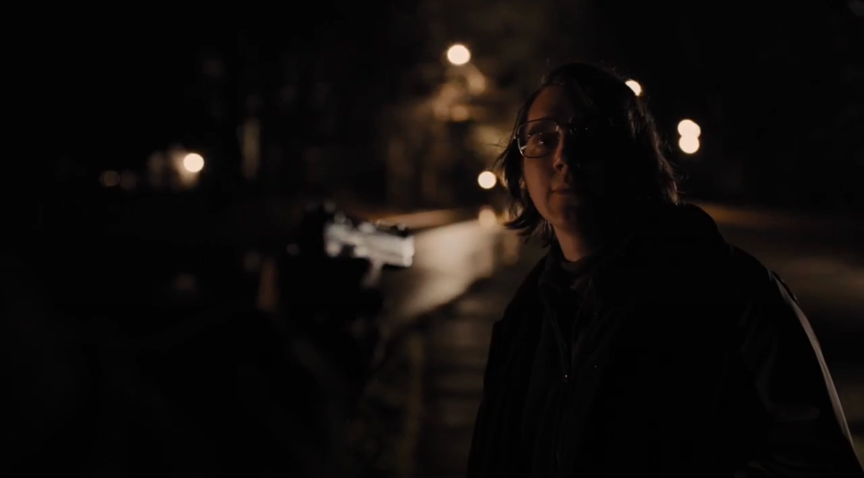
Find the rim first: it's the bright line down his left edge — the side of his hair, then the line of his shoulder — where light wraps just around his outline and stops. That's the whole idea: it's a band of pure tonal contrast, but instead of lighting a broad surface like Barry Lyndon's face, it's squeezed into a thread along the contour. That thread is what holds his silhouette out of the night. Cover it and he sinks back into the black. (The softer light on his face is doing a different job — a motivated key, so we can recognize him. Two lights, two roles: the key reveals the face, the rim cuts the edge.)
Here's what separates a cinematographer's rim from a beginner's: it has to come from somewhere. The wider shot gives it away — no movie light, no dedicated backlight, just the warm porch and window lights of the houses down the street, sitting back and to one side, exactly where they'd need to be to catch him like that. The edge is motivated; it has a believable source in the frame, and even its warm color matches those windows. That's the difference between a rim that reads as real and one that reads as a sticker. A sourceless backlight is the dated, television look. Give the same rim a reason to exist, and it disappears into the story.
This is the separation half of the trade-off from the motivated lighting guide: a rim keeps your subject visible, but a sourceless one breaks the realism. The fix is always the same — give the edge a reason. A window, a porch light, a streetlight, a neon sign, the moon.
From difference to prompt.
You can't place a backlight in an AI prompt, but you can describe the difference you want and where it comes from. The move is the same every time: don't just describe the subject — describe how the subject differs from the background, and give that difference a source.
Neither prompt uses the word "cinematic," and the second one never just says "rim light" and hopes — it says where the rim comes from. That single habit, naming the source of the difference, is what turns a flat AI subject into one that stands in the frame instead of on top of it.
The Core Ideas
- Separation is a difference, built with light. Not "make the subject brighter" — make it different from what's behind it.
- Texture: light the background into a pattern, and a smooth subject reads as the place the pattern breaks. (Form — modeling the subject into volume — reinforces it.)
- Tone: the most basic difference. Put the subject a different brightness than the wall. It works even when they're the same color.
- Color: a warm subject in a cool world separates with no extra light at all. Think relationship, not subject.
- Rim: tone concentrated at the edge — the most powerful tool, but it must be motivated, or it reads as a sticker.
- The background is half of every separation. Don't just light the subject; build the difference between the subject and what's behind them.
Study the light in every frame
you can't stop thinking about.
Save stills, break down the lighting setup, and build a private library of the frames that teach you to see.
Start Studying